


Overview
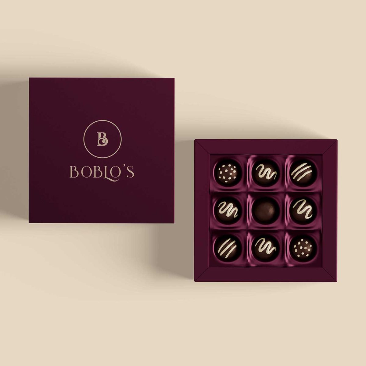
Elegant Typography Logo Boblos Sweets & Bakers is a premium dessert and bakery brand built on the principles of warmth, tradition, and artisanal excellence. From handcrafted cakes and pastries to signature breads and confectionery, every creation tells a story of passion and heritage. To capture the essence of this brand in a single visual identity, we embarked on designing an Elegant Typography Logo that would speak directly to both the heart and the palate.
The objective was clear—create a timeless mark that reflects Boblos’s dedication to quality while appealing to the evolving sensibilities of modern consumers. The visual identity needed to balance two worlds: the nostalgic charm of traditional bakeries and the clean sophistication expected from premium dessert brands today. The result is a logo that feels familiar yet fresh, rich yet approachable—an emblem of taste in every sense of the word.
Design Concept
At the heart of the design is a typography-based letter “B”, the initial of Boblos, transformed into more than just a letter—it’s a symbol of craftsmanship. The refined curves of the “B” take inspiration from the gentle swirl of icing on a cake, the soft folds of dough, and the elegance of hand-piped chocolate.
This was no generic font adaptation; it was a meticulously tailored character designed to embody:
- Grace – Through its balanced curves and flowing form.
- Quality – By maintaining strong, clean lines that communicate precision.
- Warmth – Through subtle softness in its serifs and rounded strokes.
The intention was to make the “B” instantly recognizable, so that over time, customers would associate the letter not only with the name Boblos but also with the sensory memory of rich aromas, sweet flavors, and joyful moments.
Typography & Color Palette
Typography plays a critical role in shaping the tone of a brand, especially for a bakery with a luxury positioning. For Boblos, a custom serif typeface was developed to exude sophistication, tradition, and reliability. Serif fonts inherently convey heritage and trust—values essential for a brand deeply rooted in artisanal baking methods.
- The Typeface – Elegant yet legible, with fine details that hint at handcrafting, much like the bakery’s offerings.
- Weight & Proportions – Balanced thickness for visibility across large and small formats without losing character.
The color palette is a warm, deep dark brown, reminiscent of rich chocolate, freshly baked crust, and the inviting tones of a cozy bakery. This hue represents indulgence, comfort, and richness—qualities Boblos wants every customer to experience.
Supporting tones in lighter beige and cream may be incorporated in applications to reflect whipped cream, buttery pastries, and flour-dusted surfaces, further reinforcing the brand’s sensory connection.
Brand Feel
The Boblos brand identity is carefully designed to evoke an emotional response:
- Elegant yet approachable – High-end quality without feeling exclusive or distant.
- Classic with a contemporary twist – Rooted in baking heritage, yet styled for today’s digital-first market.
- Rich, warm, and inviting – A design that feels as comforting as the aroma of fresh bread on a winter morning.
This balance ensures Boblos appeals to a broad customer base—from long-time bakery patrons seeking authenticity to younger audiences looking for aesthetic appeal and Instagram-worthy treats.
Applications
The logo was designed with versatility in mind, ensuring it adapts seamlessly to various brand touchpoints without losing integrity or legibility. Some key applications include:
- Packaging – From cake boxes to bread wrappers, the logo will be prominently displayed, enhancing perceived value and encouraging repeat purchases.
- Signage – Storefronts, interior décor, and display boards will use the logo to set the tone for the in-store experience.
- Social Media – Adaptable for profile icons, watermarks, and content branding, ensuring a consistent identity across digital platforms.
- Product Labels – Perfectly scaled for jars, pastry tags, and specialty product stickers.
- Promotional Material – Business cards, menu designs, and event invitations will maintain the same visual elegance.
By designing with scalability in mind, the logo retains its charm whether embossed in gold on premium packaging or subtly placed on a coffee cup sleeve.
Conclusion
The Elegant Typography Logo for Boblos Sweets & Bakers is more than just a visual mark—it’s a storytelling device. It embodies the artistry, care, and dedication behind every product the brand offers. Each curve of the “B” is a nod to tradition, while its clean sophistication points toward a bright, modern future.
Through its custom serif typography, rich chocolate-inspired color palette, and versatile design, the logo positions Boblos as a bakery where quality meets elegance, and where every visit feels like a special occasion. Whether seen on a box of delicate macarons, a rustic loaf of bread, or an Instagram post announcing the day’s special, the logo is a promise of excellence and warmth.
Boblos now carries a brand identity as deliciously refined as the sweets and baked goods it creates—a perfect pairing of taste and design.


